UI Widgets Intro
The Dialogue Graph, Nodes, Decorators, and Conditions decide what happens in a conversation - none of them draw a single pixel on screen. This section covers the layer that actually shows a conversation to the player: five base Widget Blueprint classes you subclass to build the look of your dialogue UI, and one runtime component that owns, shows, hides, and drives whatever you build from them.
1. Two Separate Concerns
Building dialogue UI in this plugin splits cleanly into two jobs, and it helps to know which one you're doing before you start:
- Building the UI - subclassing the five base widget classes under
Source/MounteaDialogueSystem/WBP/in your own Widget Blueprints, laying out the visuals, and wiring the Blueprint-implementable hooks each one exposes. This is almost entirely a Blueprint job. - Wiring up the runtime - attaching
MounteaDialogueParticipantUserInterfaceComponentto the right actor so it can actually create your dialogue widget, show/hide it, and relay player input back to theMounteaDialogueManager. This is a component you attach and configure, not one you subclass.
Info
If you're building dialogue UI for the first time, read the five widget pages in this section first - they explain what you're subclassing and why. If you already have a dialogue Widget Blueprint and just need to get it showing on screen and receiving player input, skip ahead to the Participant UI Component page.
2. How the Widgets Are Wired Together
None of the five base widget classes spawn each other automatically end to end - a project wires them together by naming classes in two places:
UMounteaDialogueConfiguration- the swappable data asset covered in Configuration holds the project-wide default widget class (DefaultDialogueWidgetClass) thatMounteaDialogueParticipantUserInterfaceComponentspawns when a dialogue starts.- The root
MounteaDialoguewidget's own class properties -DialogueOptionsContainerClass,DialogueOptionClass,DialogueRowClass, andDialogueSkipClass, each set in the Details panel of yourMounteaDialogueBlueprint subclass and each constrained viaMustImplementto the matching interface, so you can't accidentally assign the wrong widget type.
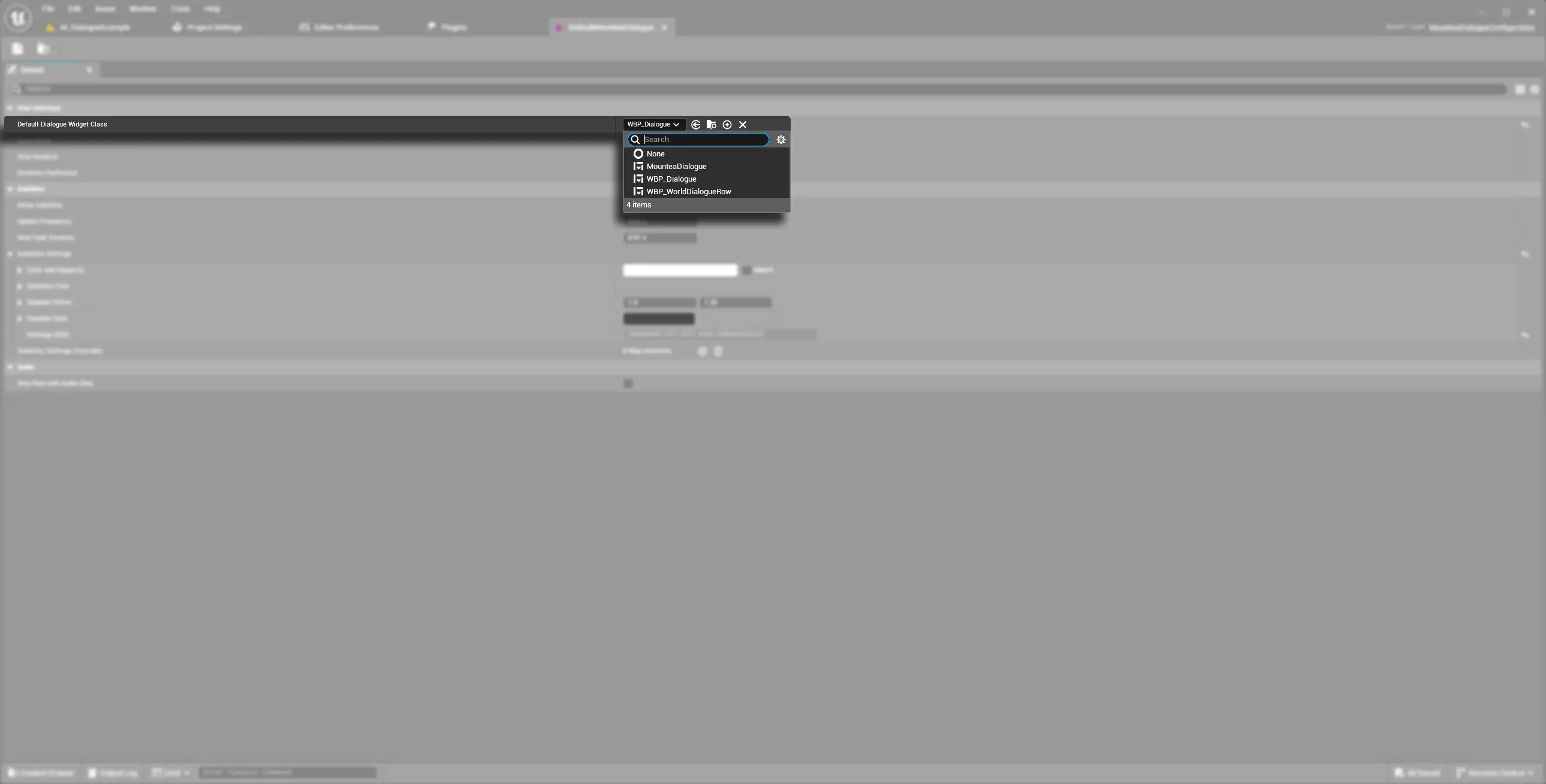
The screenshot above shows the equivalent picker on the Configuration/Settings side - selecting which Widget Blueprint class is the project's default dialogue widget. The same MustImplement-gated class picker pattern shows up on the MounteaDialogue widget itself for its four child classes.
A reader building the visuals cares about the five widget classes below. A reader wiring up runtime behaviour - showing the widget, hiding it, forwarding option clicks - cares about MounteaDialogueParticipantUserInterfaceComponent, which is a separate object entirely and is not one of the five widgets.
3. The Widgets at a Glance
| Widget | What It Does |
|---|---|
| Dialogue Widget | The root/panel widget - a composition root naming which child widget classes to use, with no spawning logic of its own. |
| Dialogue Row Widget | Displays one line of dialogue and drives a fully native typewriter reveal effect. |
| Dialogue Option Widget | One answer button - handles focus and broadcasts its own selection. |
| Dialogue Options Container | Actually spawns the Option widgets and keeps exactly one focused for gamepad/keyboard navigation. |
| Dialogue Skip Widget | A skip-forward affordance that ships completely inert - you supply the visuals. |
| Participant UI Component | The runtime ActorComponent that owns the on-screen widget instance and relays player input to the Manager. |
Warning
The five widgets are all implicitly Blueprintable UUserWidget subclasses with near-empty C++ bodies - they're meant to be subclassed in a Widget Blueprint. MounteaDialogueParticipantUserInterfaceComponent is the opposite: Blueprintable but shipped with full native logic, meant to be attached as-is rather than subclassed.